
Behind the image: Romeo & Juliet
There's a lot that goes into a theatrical advertising image that at first glance you would be forgiven for missing.
This was a commission from Sherman Theatre to come up with a concept produce a show image to promote their Romeo and Juliet - directed by Rachel O'Riordan. The final image was used in so many ways including traditional flyers, posters, advertising through to animated banners and an etrailer.
So, what went into the production of this?

The finished image
Here's some things you might not realise…
PLUS
Before even being prepared to listen to my concepts - I had to (and justly in retrospect) have read the entire Shakespeare play.
The female model was more than happy to pose in this 'implied nude' shot but we had to ensure her face was hidden.
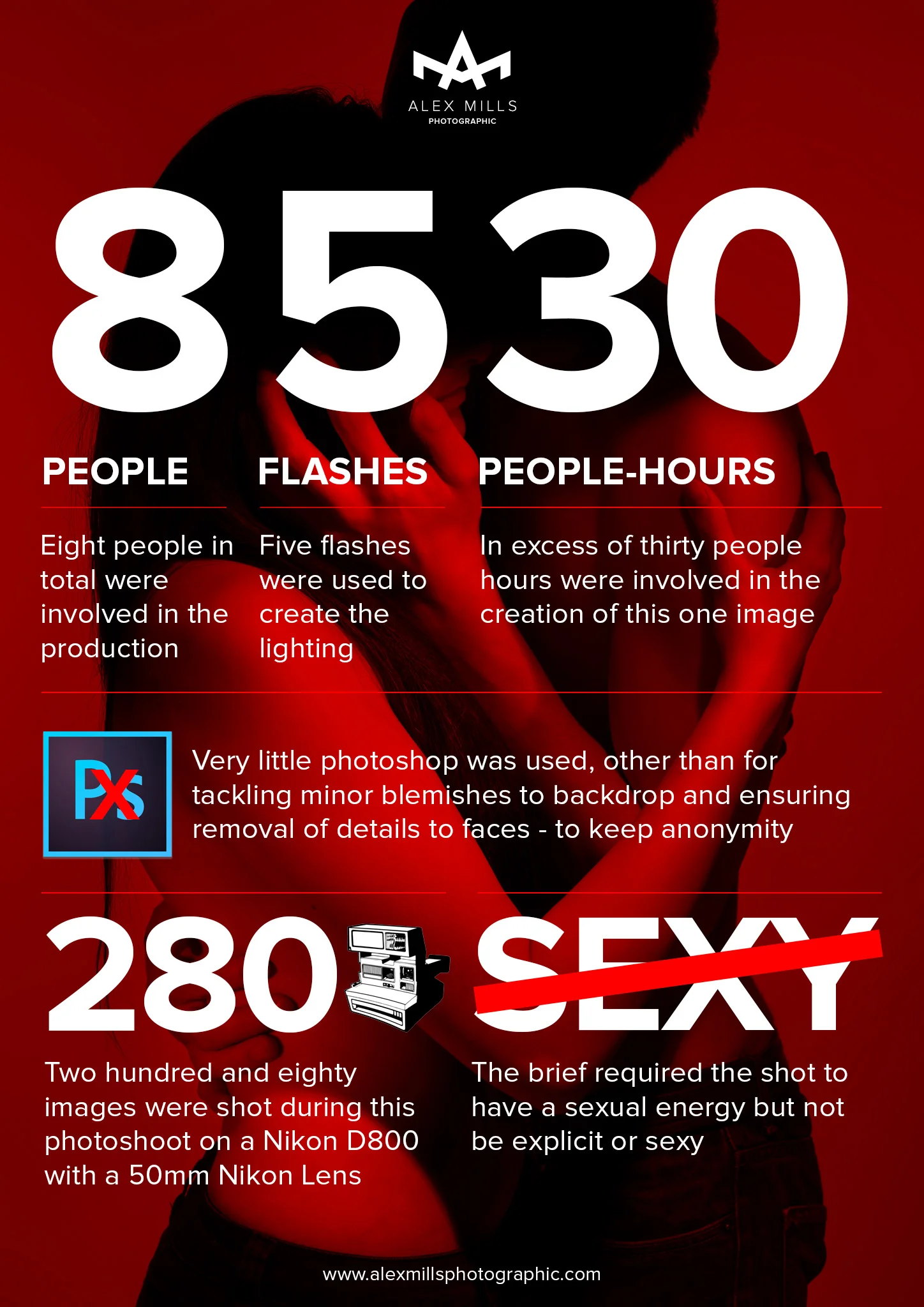
Preparation of the image included the following people:
2 models
1 makeup artist
2 representatives from client
1 assistant / retoucher
1 photographer / Art director (me)
1 hour initial meeting
Plus, in actual people-hours, it also included:
6 hours research & reading
3 hours model management
3 hours conceptualising and scamp development
3 hours on site shooting (thats six man-hours for myself and assistant AND six for 2 x client representatives)
1 hour setup/takedown
3 hours post production including shortlisting images
This all before the image has even been used in the design collateral that we produced at burningred.
As mentioned - before going any further I had been told to read the play. I did actually read it. I also listened to the audio book so I could squeeze it in to rather a hectic daily workload. I'd normally research a topic for any creative shoot that I do, so this was no major chore, if not just a little more in depth.
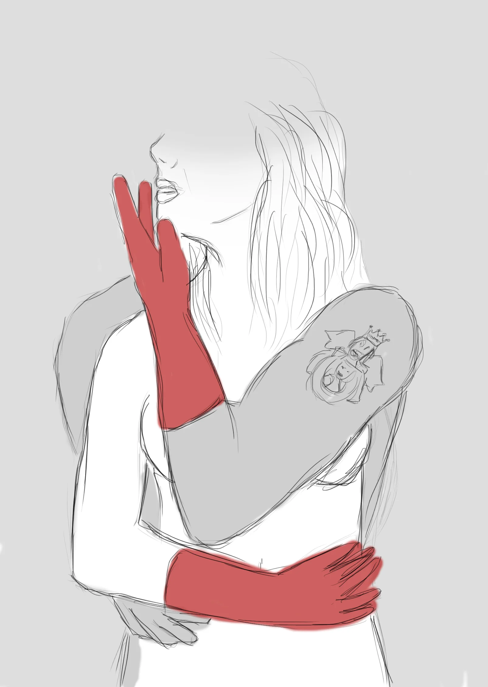
The concept I had came around from a key line within the play
"See how she leans her cheek upon her hand.
O, that I were a glove upon that hand,
That I might touch that cheek!"See how she leans her cheek upon her hand.
O, that I were a glove upon that hand,
That I might touch that cheek!"
William Shakespeare
So in some of our initial concepts we did include a glove as you will see in the scamp below. Also, early on it was discussed and agreed that concealed nudity would be a potential avenue to explore, as long as it hit the right mark and wasn't too risque or gratuitous. After all, it did need to be able to go into print in magazines etc.
We did an initial tester shot or two - just to see if the concealed nudity idea would work and that the lighting did what we needed it to. This was one thing that we had to think on our feet on in the shoot as it didn't quite work - so we shuffled bodies around and tried a few different things (as is very much the way on shoots - you can only plan so much).
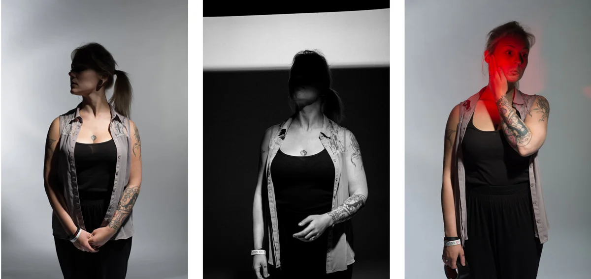
Making sure the lighting behaved with some tester shots before the subjects turned up.
As we developed the idea we lost the gloves and focused on using the light to illuminate a metaphorical glove which worked better and added extra depth and meaning.
Sourcing models
I usually approach models directly - especially when a particular look is required. However, in this instance - I put a casting call out using purpleport (where I have a photographic profile / network) which allowed me to give clear expectations in regards the concept and requirement especially as this shoot was slightly more sensitive and would be requiring nudity, and working with another model of the opposite sex. I created a shortlist of applicants for the client, and we chose models that fitted their brief and actual production (at the time of shooting, the actual actors hadn't been cast). On the shoot, both models were fantastic and after an initial few shots, we started to roll and try different ideas.
Notes on lighting & setup
As mentioned - the lighting of this shot was pretty much done all 'in camera' - meaning that we didn't have to do lots in Photoshop afterwards other than tidy a few things up.
The image below shows the 'tent' we made on set. We had planned this in advance in my studio. Fortunately we had a large enough space to set it up. All the lighting was pretty much in place other than the strobes with the red gels - these were position on the fly when the subjects were in place.
All the elements used - click for larger image
We really wanted the light to 'cut off' - I.e. Stop the light quite dead with a harsh shadow - rendering the faces into pure shadow but illuminating the rest of the subject. We achieved this with a bare bulb and reflector above - this produces a harsh strong light which will cut off. We tried With a soft box but the light didn't achieve the effect we wanted and filled way too much of the face in. We used black reflectors at the side to really suck any additional light.
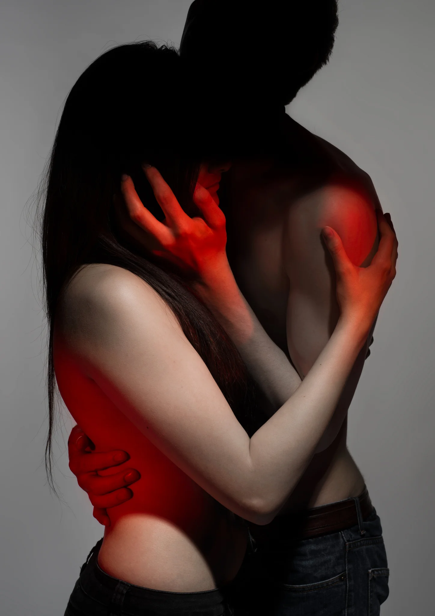
To turn the background grey, I ensured the total light being thrown on the the backdrop was less than the total light being thrown on to the subject. This was tested by doing a few light tests and adjustments until I was happy with the results. I tried the shot without lights on the backdrop, but the creases remained too prominent - and remember, I'm trying to eliminate time in photoshop after the shoot.
In addition we had two lights lighting the backdrop to make it as evenly lit as possible plus then two strobes with a red gel (OK, we used red acetate from hobbycraft) which we he fashioned with a homemade snoot (a3 piece of card rolled into a loose cone - interested in more info about snoots, then check this post from WEX). We used this to more precisely focus the 'red spot'.
An image that reflects your actual requirements is an investment. Not just in terms of cost but in time for the client and all those involved and it really is true that preparation is crucial for your shoot.
More photoshoots
Show advertising imagery for Welsh-language production of Ionesco’s ‘Rhinoseros’ by Theatr Genedlaethol Cymru.